
Last November, WNYC and PRI’s Studio 360 polled its audience to find the subject of its next redesign project, and teaching emerged as a profession in need of an image makeover.
Teachers contacted Studio 360 out of frustration for the “old fashioned iconography” that has, for too long, “childishly” symbolized their profession. Kate Ahern, a teacher in Massachusetts, aptly deemed the conglomeration of images “apple crapple.”
Studio 360 enlisted the Brooklyn design firm Hyperakt “to create a new visual vocabulary that reflects the multi-dimensional role of teachers.” This team focuses on “meaningful design for the common good” and has led projects for UNICEF and GOOD magazine. Hyperakt Co-founder Deroy Peraza identified this project’s major challenge as “to elevate the profession to its rightful place of importance in our society.”
The project’s foundation is built on the premise that “education is the key to human progress, therefore teaching is among the most important professions for humanity.”
The result is engaging, inspiring, reflective, and meaningful; it’s enough to make a teacher proud.. of himself.
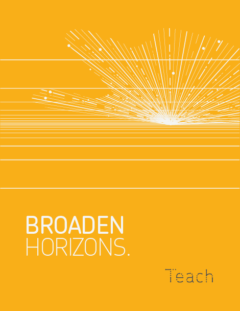
Take a look at Hyperakt’s design and the full presentation with insights into the development process. They’ve released their work – including logos, posters, signs, and one very unique calendar, under a non-commercial creative commons license.
You are invited to “download and use the visuals to celebrate the multidimensional role of teachers.”
Here’s a sneak peak:
To the STC community: Does Hyperakt’s work well represent your own? Will you use them in your school? Share your thoughts in the comments below.